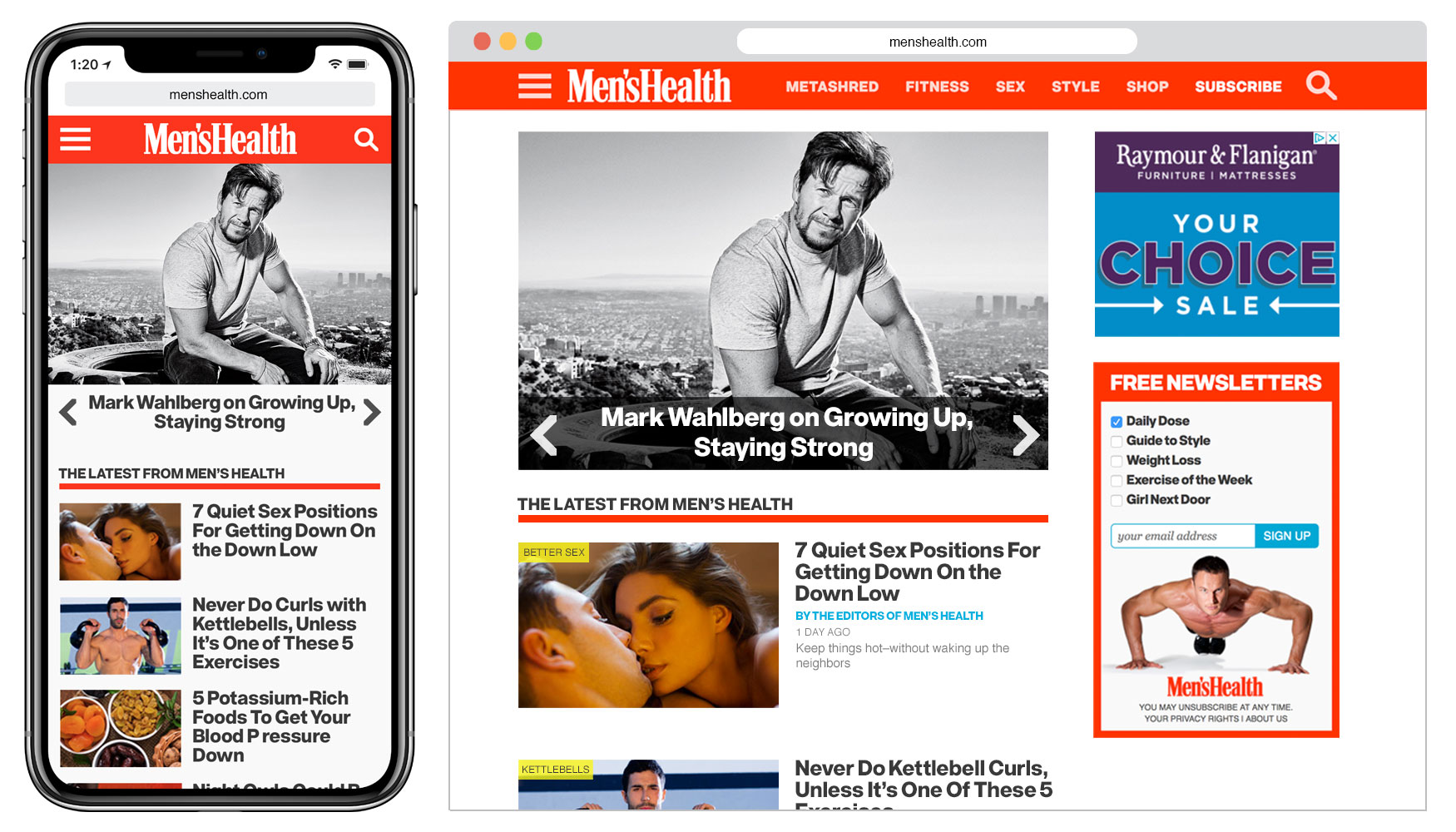
I was the lead designer on the 2016 responsive redesign of MensHealth.com. My goal was to seamlessly and thoroughly integrate the Men’s Health brand identity into the site’s user interface. The homepage view (below) shows bold use of the brand’s color palette, aggressive custom iconography (thick slab menu icon, angular carousel arrows), and dominant-yet-highly-readable typography.
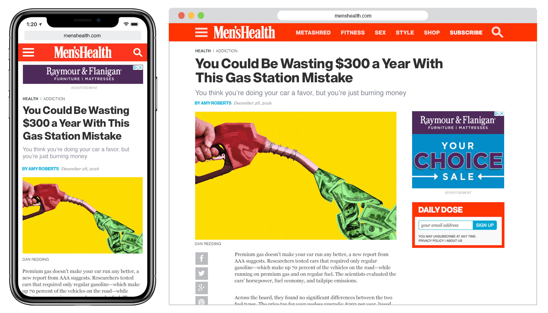
The article view at MensHealth.com (below) puts an emphasis on the big sans-serif headline, while incorporating the geometric icon style into the share button bar. This article also includes an editorial photo-illustration by myself.